Display Modes Guide
Explore all the visual options available in the Minimal Status Panel and learn when to use each mode for maximum impact.
🎨 Display Mode Overview
The Minimal Status Panel offers 3 display modes and 3 display levels for a total of 9 different visual combinations. Each is optimized for specific use cases and screen sizes.
📊 Display Modes
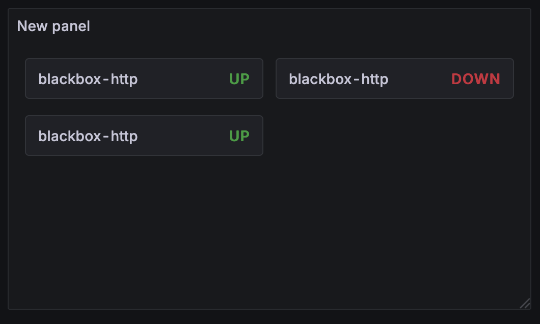
List Mode
Best for: Detailed monitoring, smaller service counts (5-15 services)
Traditional vertical layout that provides maximum information density while maintaining readability.
Characteristics:
- ✅ Full information visibility
- ✅ Excellent readability
- ✅ Optimal for detailed analysis
- ❌ Takes more vertical space
Use cases:
- Operations dashboards
- Detailed service monitoring
- Status pages with full details
- Team-specific monitoring views
Grid Mode
Best for: Overview dashboards, medium service counts (10-30 services)
Responsive card-based layout that adapts to screen size while showing comprehensive information.
Characteristics:
- ✅ Responsive design
- ✅ Good information density
- ✅ Visually appealing cards
- ✅ Scales well across devices
Use cases:
- Executive dashboards
- Multi-team overview screens
- Service portfolio displays
- Public status pages
Compact Mode
Best for: Status walls, large service counts (30+ services), space-constrained displays
Minimal colored dots that provide maximum service density with minimal screen real estate.
Characteristics:
- ✅ Maximum density
- ✅ Instant visual status overview
- ✅ Ideal for large screens
- ❌ Limited detailed information
Use cases:
- NOC status walls
- Large screen displays
- Quick health overviews
- High-density monitoring
🔍 Display Levels
Ultra-Minimal Level
Shows only the essential information: service name and current status.
What’s included:
- Service name
- Status text (Up/Down/Warning)
- Status color coding
Perfect for:
- Maximum information density
- Quick status overviews
- Mobile displays
- Executive summaries
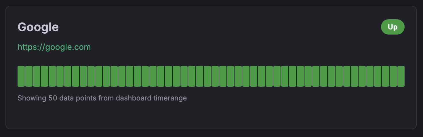
Minimal Level
Balanced view with essential monitoring information and visual status history.
What’s included:
- Service name
- Status badge
- Interactive heartbeat bar (50 data points)
- Service URL (if enabled)
Perfect for:
- General purpose monitoring
- Team dashboards
- Regular status checks
- Balanced information display
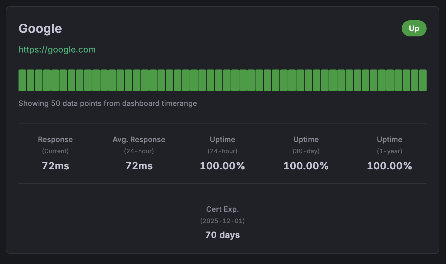
Full Level
Complete monitoring view with detailed statistics and comprehensive information.
What’s included:
- Everything from Minimal level
- Current response time
- Average response time (24-hour)
- Uptime statistics (24-hour, 30-day, 1-year)
- SSL certificate expiration info
- Last check timestamp
Perfect for:
- Operations centers
- Detailed troubleshooting
- Performance monitoring
- SLA tracking
🎯 Combination Examples
1. List + Ultra-Minimal
Configuration:
{
  "displayMode": "list",
  "displayLevel": "ultra-minimal",
  "showLabels": true,
  "maxItems": 20
}
Best for:
- Customer status pages
- Mobile dashboards
- Quick health checks
- Executive reporting
2. List + Minimal
Configuration:
{
  "displayMode": "list",
  "displayLevel": "minimal",
  "showLabels": true,
  "showUrls": true,
  "maxItems": 15
}
Best for:
- Team monitoring dashboards
- General service oversight
- Balanced information display
- Daily operations
3. List + Full
Configuration:
{
  "displayMode": "list",
  "displayLevel": "full",
  "showLabels": true,
  "showUrls": true,
  "showLastCheck": true,
  "showResponseTime": true,
  "maxItems": 10
}
Best for:
- Operations centers
- Detailed performance monitoring
- SLA tracking dashboards
- Troubleshooting interfaces
4. Grid + Minimal
Perfect for responsive dashboards
Visual: Imagine the minimal cards arranged in a responsive grid (2-4 columns depending on screen size)
Configuration:
{
  "displayMode": "grid",
  "displayLevel": "minimal",
  "showLabels": true,
  "maxItems": 20
}
Best for:
- Executive dashboards
- Overview screens
- Public status displays
- Multi-service monitoring
5. Grid + Full
Comprehensive information in card format
Visual: Full information cards arranged in a responsive grid
Configuration:
{
  "displayMode": "grid",
  "displayLevel": "full",
  "showLabels": true,
  "showUrls": false,
  "maxItems": 12
}
Best for:
- Detailed overview dashboards
- Service portfolio displays
- Performance monitoring grids
- Team-specific views
6. Compact + Any Level
Maximum density status indicators
Visual: Small colored status dots arranged horizontally with optional tooltips
Configuration:
{
  "displayMode": "compact",
  "displayLevel": "ultra-minimal",
  "showLabels": false,
  "maxItems": 50
}
Best for:
- Status walls
- Large screen displays
- Quick health indicators
- High-service-count environments
🎨 Visual Design Elements
Status Colors
- 🟢 Green (#28a745): Service is Up and healthy
- 🔴 Red (#dc3545): Service is Down or failing
- 🟡 Yellow (#ffc107): Service has Warnings
- ⚪ Gray (#6c757d): Service is in Maintenance
- ⚫ Dark Gray: Unknown status
Heartbeat Bar
Interactive 50-point timeline showing service health over time:
- Full height bars: Service was up during this period
- Shorter bars: Service was down or had issues
- Hover tooltips: Show exact timestamp and status
- Color coding: Matches status colors
Typography
- Service names: Bold, prominent display
- Status badges: High contrast, colored backgrounds
- Statistics: Clean, easy-to-read metrics
- URLs: Styled as links with hover effects
📱 Responsive Behavior
Grid Mode Breakpoints
- Large screens (>1200px): 4 columns
- Medium screens (768-1200px): 2-3 columns
- Small screens (<768px): 1-2 columns
- Mobile (<480px): 1 column
List Mode
- Maintains consistent width
- Font sizes adjust for readability
- Heartbeat bars scale proportionally
Compact Mode
- Dots resize based on available space
- Maintains minimum touch targets (44px) on mobile
- Tooltips adapt to screen edges
🎯 Choosing the Right Mode
Consider Your Audience
Technical Teams
- Use Full level for detailed metrics
- List mode for detailed analysis
- Show all options (URLs, timestamps, response times)
Executives/Management
- Use Minimal level for key information
- Grid mode for visual appeal
- Hide technical details, focus on status
Public/Customers
- Use Ultra-minimal or Minimal level
- List mode for clarity
- Use custom names for user-friendly service names
Consider Your Screen
Desktop Monitors
- Any mode works well
- Full level recommended for detailed work
- Grid mode for overview dashboards
Laptops
- Grid or List mode work best
- Minimal level for balanced information
- Consider screen resolution
Tablets
- Grid mode excellent for touch interfaces
- Minimal level for readability
- Larger touch targets
Mobile Phones
- List mode for readability
- Ultra-minimal or Minimal level
- Limit items to 5-10 for performance
Large Displays/TV Screens
- Compact mode for status walls
- Grid mode for detailed overviews
- Larger fonts may be needed
Consider Your Data Volume
Few Services (1-10)
- List + Full: Show everything
- Take advantage of available space
Medium Count (10-30)
- Grid + Minimal: Balanced approach
- List + Minimal: Focus on essentials
Many Services (30+)
- Compact mode: Maximum density
- Grid + Ultra-minimal: Overview approach
- Consider multiple panels or filtering
💡 Pro Tips
- Test different modes with your actual data to see what works best
- Use consistent modes across related dashboards for user familiarity
- Consider your refresh rate: More detailed modes may need longer refresh intervals
- Match the mode to the purpose: Detailed for troubleshooting, overview for monitoring
- Think about your users: What information do they need most?
🔧 Customization Tips
Color Customization
The plugin respects Grafana’s theme colors, but you can customize through:
- Dashboard-level theme settings
- Organization-level custom styling
- Grafana’s color preferences
Font Adjustments
- The plugin uses Grafana’s standard fonts
- Font sizes scale automatically with display modes
- Consider Grafana’s accessibility settings for larger text
Spacing and Layout
- Grid column counts adjust automatically
- List item spacing is optimized for readability
- Compact mode maintains minimum usability standards
Ready to implement these modes? Head to the Configuration Guide for detailed setup instructions!